
Master Your Marketing: How a Content Calendar Can Transform Your Strategy
Staying organized and strategic is paramount in digital marketing, and a content calendar serves as an essential tool to achieve this. By implementing a content calendar, you can effectively plan your content strategy, ensuring that your marketing efforts are not only consistent but also aligned with your business goals. The benefits of a content calendar extend beyond mere scheduling; it fosters team collaboration in content creation and allows you to tailor your approach to suit varying needs. As we delve deeper into this guide, you’ll discover how mastering a content calendar can empower you to elevate your marketing strategy, maximize engagement, and drive your business towards unprecedented success. Understanding Content Calendars Definition and Purpose A content calendar is a strategic tool used to plan, organize, and publish content across various platforms. Its primary purpose is to ensure that your content strategy aligns with your business goals, maintaining consistency and coherence in your messaging. By clearly mapping out your content schedule, you can anticipate upcoming events, promotions, and campaigns, allowing for more proactive content planning. This foresight helps in avoiding last-minute scrambles and enables you to create content that is timely and relevant. Additionally, a content calendar aids in visualizing your content mix, ensuring a balanced distribution of topics and formats that cater to your audience’s preferences. In essence, it acts as a roadmap for your marketing efforts, guiding your team in content creation and fostering better team collaboration. This organized approach not only boosts productivity but also enhances the overall effectiveness of your content strategy. Types of Content Calendars Content calendars come in various forms, each serving different purposes to meet specific marketing needs. The most common types include editorial calendars, social media calendars, and marketing campaign calendars. An editorial calendar is used to plan and schedule blog posts, articles, and other long-form content, ensuring that content aligns with your overarching content strategy. Social media calendars, on the other hand, focus on scheduling posts across platforms like Facebook, Instagram, and Twitter, helping maintain a consistent online presence. Marketing campaign calendars are designed to coordinate multiple content types and channels, providing a unified timeline for launching comprehensive campaigns. Choosing the right type of content calendar depends on your business goals and the scope of your activities. Some businesses might benefit from a hybrid approach, combining elements from different calendar types to create a customized tool that fits their content planning needs. How to Choose the Right Calendar Selecting the right content calendar involves evaluating your unique business needs and marketing objectives. Start by assessing your content strategy to determine the types of content you produce most frequently. If your focus is primarily on blog posts or articles, an editorial calendar might be ideal. For businesses with a strong social media presence, a social media calendar can help maintain consistent engagement with your audience. For those managing complex campaigns involving multiple channels, a marketing campaign calendar could be most beneficial. Consider also the size of your team and the level of collaboration required. If your team is large, choose a calendar that supports seamless team collaboration in content creation. Additionally, evaluate the tools and platforms you currently use; some offer integrated calendar features that could streamline your workflow. Ultimately, the right content calendar should align with your goals, enhance productivity, and simplify content planning processes. Benefits of Using a Content Calendar Streamlining Content Strategy A content calendar acts as a powerful tool for streamlining your content strategy by providing a clear and structured framework for planning and execution. By mapping out your content in advance, you can ensure that every piece aligns with your business objectives and marketing goals. This forward-thinking approach allows for the strategic distribution of content, ensuring a balanced mix of topics, formats, and platforms. Additionally, a content calendar helps identify gaps and redundancies in your content plan, enabling you to make informed adjustments and enhancements. This organized method reduces the risk of last-minute content creation, thus minimizing stress and increasing the quality of your output. By having a visual representation of your content schedule, teams can easily track progress and deadlines, improving accountability and productivity. Ultimately, a content calendar not only streamlines content planning but also enhances the overall effectiveness and impact of your content strategy. Ensuring Consistent Content Delivery Consistency in content delivery is crucial for establishing and maintaining a strong online presence. A content calendar serves as a reliable tool to achieve this consistency by organizing your content schedule and ensuring timely publication. With a content calendar, you can plan posts well in advance, avoiding the pitfalls of irregular posting that can lead to audience disengagement. This proactive approach allows you to maintain a steady flow of content, keeping your audience engaged and informed. Additionally, a content calendar helps balance various content types, distributing them evenly across different channels to optimize reach and engagement. It also enables you to align content releases with key dates, events, and campaigns, ensuring relevance and timeliness. By adhering to a structured schedule, your marketing efforts become more predictable and effective, fostering trust and loyalty among your audience. Ultimately, consistent content delivery facilitated by a content calendar strengthens brand visibility and supports long-term business growth. Enhancing Team Collaboration A content calendar is a vital tool for enhancing team collaboration in content creation. By providing a centralized location for all content-related activities, it fosters transparency and communication among team members. This shared visibility ensures everyone is on the same page regarding deadlines, responsibilities, and objectives, reducing misunderstandings and improving workflow efficiency. A content calendar also facilitates better coordination among different departments, such as marketing, design, and sales, ensuring that all content aligns with broader business goals. It allows team members to easily track progress, share feedback, and make real-time adjustments, thereby improving the overall quality and coherence of the content produced. Furthermore, a well-maintained content calendar can serve as a historical record, offering valuable insights into past campaigns and strategies, which can be used for future planning. Ultimately, by streamlining communication
From Desktop to Mobile: Transform Your Website with These Responsive Design Best Practices
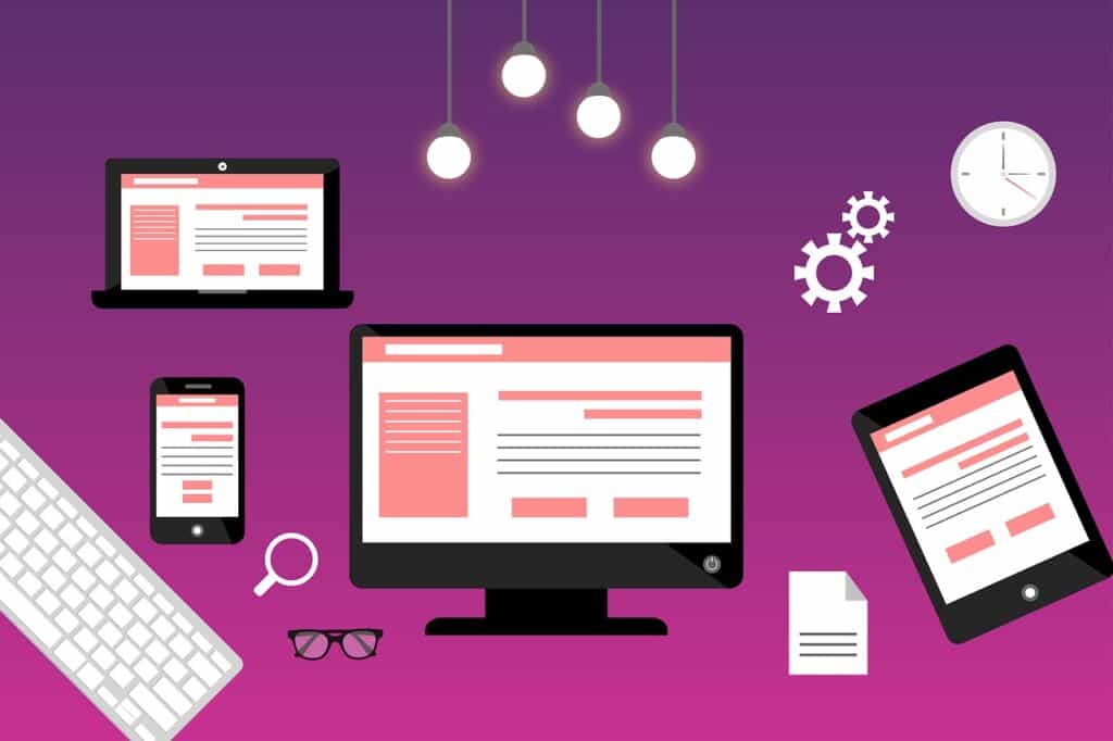
A mobile-friendly website is no longer a luxury; it’s a necessity. Responsive web design ensures your website looks great on any device, improving user experience and boosting SEO. By following core principles like fluid grids, flexible images, and media queries, you can create a website that captivates your audience and drives conversions. This guide will explore best practices, from mobile-first design to cross-browser compatibility, helping you build a dynamic website that meets the needs of modern consumers. Understanding Responsive Web Design Defining Responsive Web Design Responsive web design refers to the approach of creating websites that adapt to different screen sizes and devices. This means your website will look and function well on desktops, tablets, and smartphones alike. The core principles of responsive web design include fluid grids, flexible images, and media queries. Fluid grids use relative units like percentages instead of fixed units like pixels, allowing the layout to resize dynamically. Flexible images adjust within their containing elements to prevent overflow and maintain visual integrity. Media queries apply different styles based on the device’s characteristics, such as screen width, height, and orientation. By implementing these principles, you ensure a seamless and engaging user experience (UX) across all platforms. This adaptability is not just a trend but a necessity in today’s mobile-first design landscape, where users expect consistent performance regardless of their device. Core Principles Explained Responsive web design is built on three core principles: fluid grids, flexible images, and media queries. Fluid grids allow for the design layout to resize proportionally rather than using fixed-width pixels. This ensures that content adjusts smoothly to various screen sizes. Flexible images are essential for maintaining the integrity of visuals across devices. They scale within their containing elements, preventing distortion and ensuring they look sharp on any screen. Media queries enable different CSS styles based on the user’s device characteristics, such as screen width, height, and orientation. By harnessing these principles, you can create a mobile-friendly website that offers a consistent user experience (UX) across all devices. These foundational elements work together to ensure your adaptive design is both functional and visually appealing, meeting the modern user’s expectations in a mobile-first design world. Impact on Mobile Optimization Responsive web design significantly enhances mobile optimization by ensuring your website performs optimally across all devices. As mobile usage continues to surge, a mobile-friendly website is vital for capturing and retaining audience attention. Responsive design improves user experience (UX) by providing intuitive navigation and faster loading times on smartphones and tablets. This seamless functionality reduces bounce rates, keeping users engaged longer. Furthermore, search engines prioritize mobile-first design in their algorithms, which means a responsive site can boost your SEO rankings. By accommodating different screen sizes and orientations, responsive web design ensures your content is accessible and visually appealing, no matter how users access your site. This adaptability not only meets the expectations of modern consumers but also positions your brand as a leader in delivering consistent digital experiences. With responsive design, your website becomes a powerful tool for engaging users and driving conversions. Benefits of Responsive Design Enhancing User Experience (UX) Enhancing user experience (UX) is a primary benefit of implementing responsive web design. A responsive site ensures that your audience enjoys a seamless journey, whether they’re browsing on a smartphone, tablet, or desktop. This adaptability eliminates the frustration of pinching and zooming, making navigation intuitive and straightforward. Users can find information quickly, which keeps them engaged and reduces bounce rates. Additionally, responsive design enhances accessibility by ensuring content is easy to read and interact with across various devices. By prioritizing UX, your website not only retains visitors but also encourages them to explore further, increasing the likelihood of conversions. The mobile-friendly approach meets users’ expectations for fast-loading, visually appealing pages, which reflects positively on your brand. Ultimately, responsive design fosters a positive user experience that builds trust and satisfaction, essential components for cultivating a loyal customer base in today’s digital marketplace. Improving SEO and Conversions Responsive web design plays a crucial role in improving SEO and boosting conversions. By ensuring your website is mobile-friendly, you align with search engine algorithms that prioritize mobile-first indexing. This can lead to higher search rankings, making your site more visible to potential customers. A responsive design also enhances page load speed, a critical factor in both user experience (UX) and SEO. Faster sites tend to rank higher and convert better as users are more likely to stay and explore. Consistent visual and functional elements across devices build trust, reducing friction in the conversion process. Users who have a positive experience are more likely to complete desired actions such as signing up for newsletters or making purchases. Furthermore, a single, responsive website simplifies your analytics and reporting processes, providing clearer insights on user behavior. This comprehensive approach ultimately fosters a more effective digital presence, driving both traffic and sales. Boosting Cross-Browser Compatibility Responsive web design significantly boosts cross-browser compatibility, ensuring your website functions uniformly across different web browsers. This consistency is crucial as users interact with your site using various browsers like Chrome, Safari, Firefox, and Edge. By adopting a responsive design, you mitigate the risks of layout issues or functionality discrepancies that could deter users. This approach involves using standardized coding practices and testing your site on multiple browsers to identify and resolve potential glitches early on. A site that performs well across all platforms reinforces a positive user experience (UX), instilling confidence in your brand. This uniformity also simplifies maintenance since updates will apply across all browsers simultaneously, reducing overheads and technical challenges. In today’s digital landscape, ensuring cross-browser compatibility is not merely a technical requirement but a critical component of delivering a seamless and professional digital experience to a diverse audience, ultimately supporting customer retention and engagement. Key Elements for Mobile Optimization Importance of Fluid Grids Fluid grids are a foundational element in responsive web design, crucial for achieving effective mobile optimization. Unlike fixed grids that rely on static pixel measurements, fluid grids use relative units